Elevating brands, teams, and creative work through thoughtful strategy, creative direction, and systems that scale.
I’ve led creative work across enterprise, academic, and founder-led environments—shaping brand systems, national campaigns, design programs, and identities. What connects it all is how I work: I bring clarity to complex challenges, build the structure that helps strong ideas scale, invest in the people behind the work, and use AI with intention and judgment.
I connect creative direction, scalable systems, and people-centered leadership to move work forward.
Strong Systems
I build clear processes, shared standards, and practical tools—including AI-enabled workflows—that help teams work with consistency, creativity, and confidence.
Strategic Clarity
I clarify the idea behind the work and translate strategy into focused creative direction that can hold together across channels, formats, and teams.
Invested Teams
I mentor and develop people with intention, creating the trust, alignment, and meaningful ownership that help thoughtful work and professional growth thrive together.
“Monique consistently demonstrates exceptional creativity, strategic thinking, and initiative.”
— Gloria Fazio, former Marketing Manager at Baker Tilly
Leadership in action
These examples show how I connect creative vision, hands-on direction, and the systems that turn ideas into meaningful results.
Expanded an initial visual direction into a firmwide brand system—building the guidelines, tools, workflows, and team practices that supported consistent execution at national scale.
Built a modular brand system that translated strategy, product truth, creative direction, and evaluation criteria into reusable context and skills for AI-generated imagery and messaging.
Separated and restructured an academic design program into a standalone major and minor, aligning curriculum, infrastructure, and real-world learning with student and institutional goals.
Scope & scale
Across enterprise, academic, and founder-led environments, the approach remains the same: clarify the idea, strengthen the system, and help people move the work forward.
Led high-volume creative production supporting 600–800 design requests per quarter
Built and operationalized enterprise brand guidelines, templates, workflows, and shared creative libraries
Directed an integrated campaign that generated more than 98 million out-of-home impressions and contributed to two won opportunities
Built an AI-directed modular brand system for consistent image and messaging development
Launched a standalone graphic design major and minor that grew active enrollment by 175%
Managed and developed a national, distributed design team
I raise the creative standard, strengthen the team, and build the systems that help great work scale.
Brand systems, campaigns, identities, and programs shaped through strategic clarity, hands-on creative leadership, and a deep investment in the people behind the work.
Giving AI the strategic context, reusable skills, and standards to create coherent brand imagery and messaging
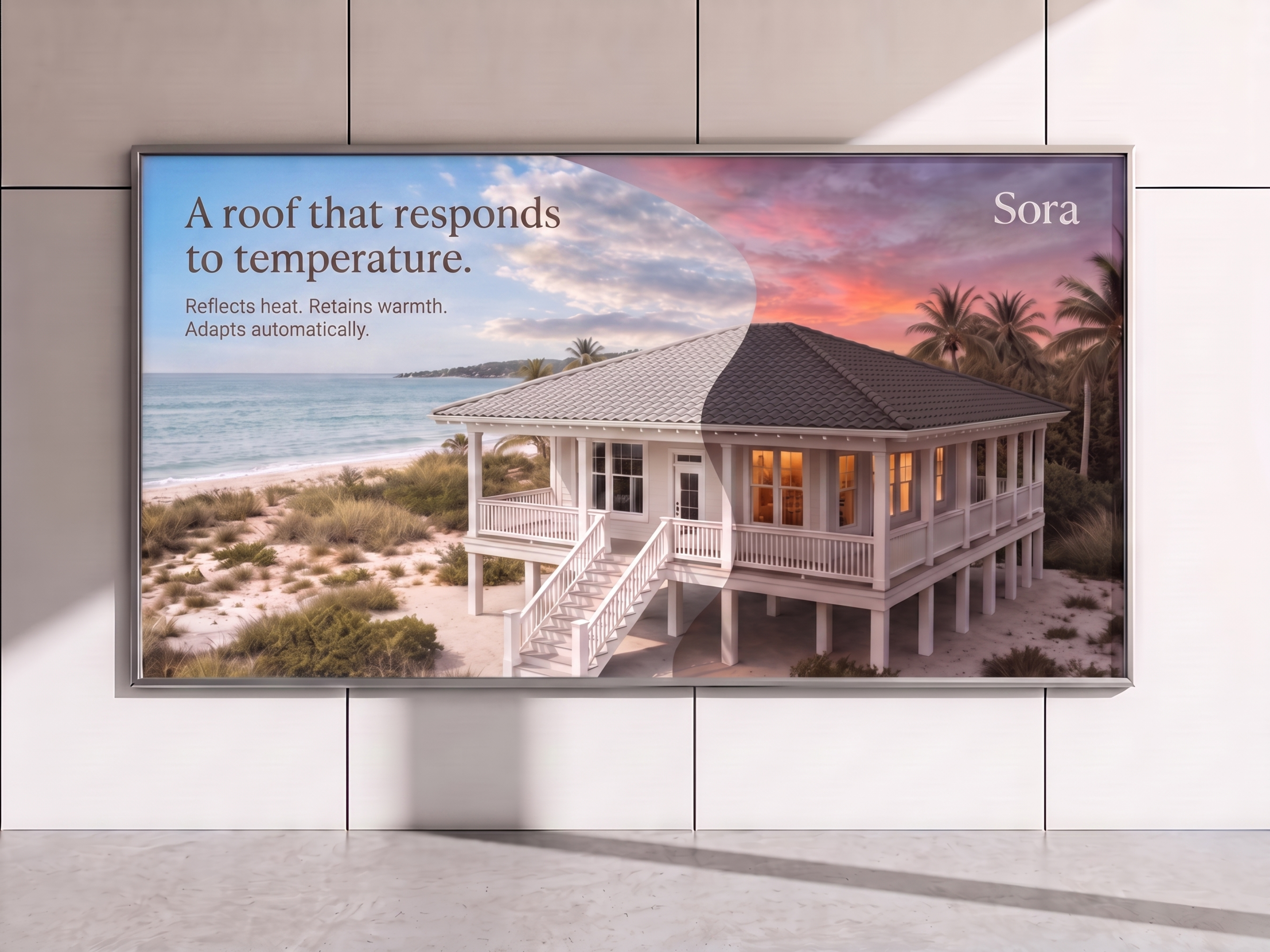
Sora campaign key art visualizing the responsive roofing system in its reflective and heat-absorbing modes.
Role
DesignerCreative directorSystem builder
Scope
Brand strategyContext engineeringGenerative image systemsReusable AI skillsGovernance
Timeline
May–June 2026
Outcome
A modular brand scaffold designed to guide both people and AIA new model for orchestrating creative work
The challenge
As part of an applied course in AI-enabled creative practice, I was challenged to build a cohesive brand using AI-assisted workflows. I developed Sora, a fictional climate-adaptive building materials brand launching with a responsive roofing system.
Because generative tools can produce convincing but inconsistent results, a strong prompt was not enough. I needed to translate Sora’s strategy, product logic, creative direction, and visual standards into clear, modular guidance that could be combined for different creative tasks—while keeping human judgment responsible for quality, coherence, and brand alignment.
Building the brand system
The Sora system began with a defined business concept, brand position, audience, product behavior, and set of creative principles. I translated that foundation into a modular scaffold of strategic, verbal, visual, product, and application guidance; reusable AI skills; and brand assets.
The brand foundation established the source material; the modular scaffold organized that material into reusable guidance, skills, and assets.
My approach
I deconstructed Sora into focused source-of-truth documents written in a simple text format that both people and AI could use. Separate files defined the brand platform, product behavior and accuracy, creative direction and visual art direction, and guidance for specific applications.
Rather than using the complete scaffold for every task, I assembled the guidance relevant to the intended outcome. Choosing the right combination for each task became an act of creative direction.
I paired those files with reusable skills for house and landscape generation, roof-profile application, compositing, divided lighting, brand writing, and governance. When something drifted, I could refine the responsible source file or skill instead of repeatedly patching an individual prompt.
The work moved me between explorer, curator, director, and builder—each role shaping a more coherent whole.
The outcome
The project expanded my systems practice into creative direction structured for use by AI. The scaffold became a framework for generating, evaluating, correcting, and extending creative work while preserving intent.
The idea of orchestration resonated because it mirrors creative leadership. A leader establishes the vision, provides the right context, creates useful processes, evaluates the work, and intervenes when it drifts.
Leadership in practice
Systems thinking
Deconstructed a brand into modular sources of truth, then reassembled the relevant guidance for each task.
Hands-on strategic leadership
Moved between brand strategy, creative direction, art direction, workflow design, image development, and evaluation.
Raising the creative standard
Evaluated outputs for accuracy, coherence, and craft; identified gaps or drift to refine the guidance and improve results.
From strategy to execution
Defining and extending the product language
I developed a recognizable surface language by combining a smooth wave form with fine striation, then evaluated how it performed as a dimensional material. Task-specific guidance extended the material across barrel tile, shingle, and vertical panel profiles.
Orchestrating the campaign imagery
The campaign workflow brought together independently developed components rather than relying on a single prompt to produce the finished image. Testing across different home styles, roof profiles, and climates demonstrated how the same creative direction could produce varied but connected results.
If you’re building or strengthening a brand, process, or team—I’d love to connect.
Building the standards, shared tools, and creative practices that helped a national brand stay consistent while continuing to evolve
When Baker Tilly introduced a brand evolution in 2022, our external branding agency partner provided the foundation: a retained logo with new color, typography, and graphic language. As Graphic Design Manager, I expanded those initial ideas into the full-fledged guidelines, creative infrastructure, templates, workflows, and team required to make the brand usable across the firm.
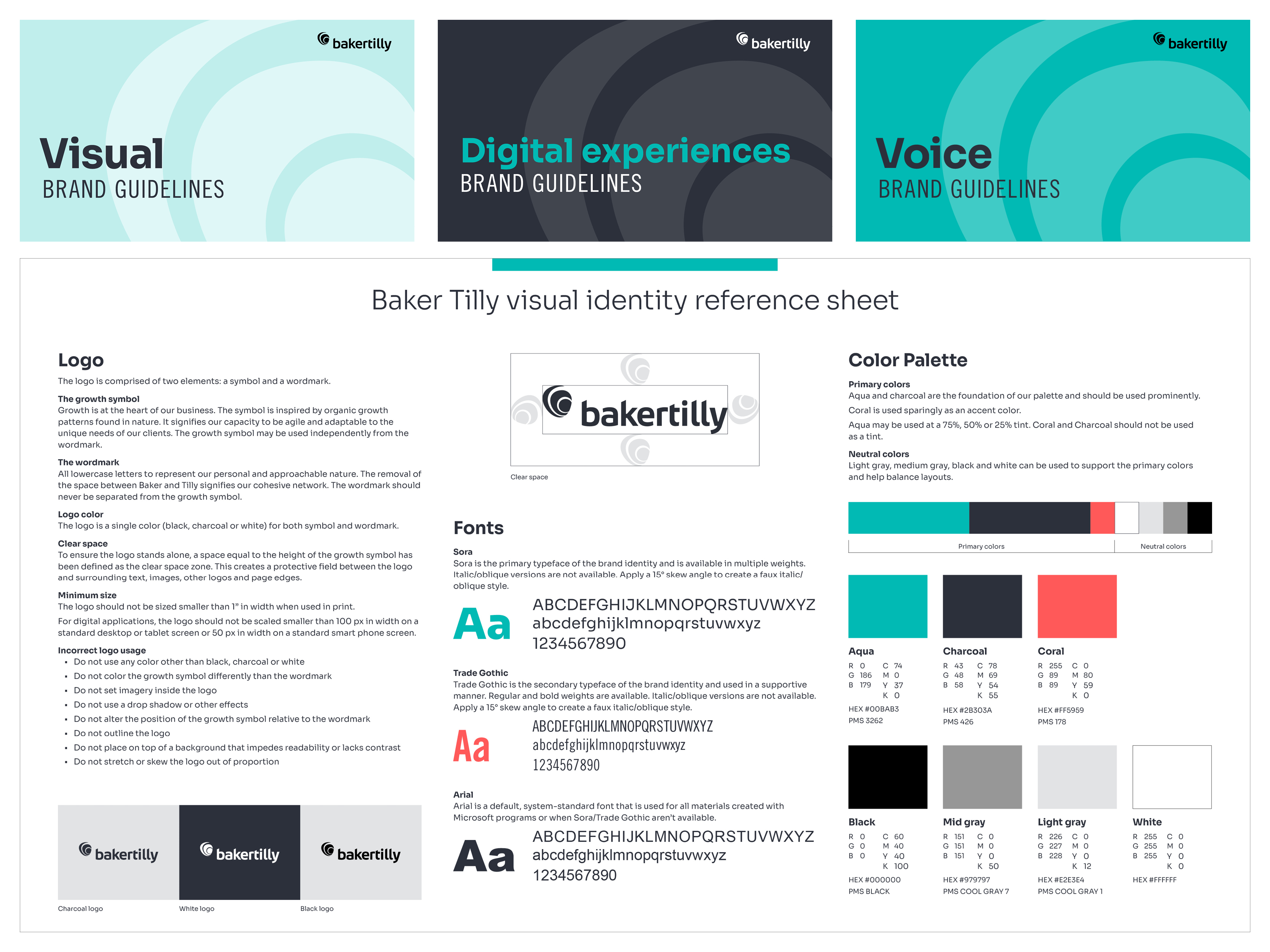
The visual identity reference sheet distilled core logo, typography, and color standards into a practical quick-reference tool.
Role
Graphic design manager
Scope
Brand governanceCreative operationsProduction managementDesign team leadership
Partners
Creative directorCopy managerDesign teamVideo team150+ marketersFirmwide departmentsExternal vendors and agencies
Timeline
Fall 2022–Fall 2025
Outcome
A repeatable identity system supporting 400+ initial conversions600–800 production requests per quarter
The challenge
The brand identity needed to scale across the firm while remaining cohesive, recognizable, and flexible enough to support varied audiences and business needs. At the same time, Baker Tilly was centralizing creative production after marketers with Adobe access had historically designed some materials themselves. We needed to establish a clear standard, help 150+ marketers adopt a new process, and give the design team enough structure to manage high volume without making every project feel identical.
My approach
I expanded the high-level creative direction provided by the agency into a comprehensive design system that could guide every brand touchpoint across the firm. In collaboration with the Creative Director and Copy Manager, I built the governance, standards, and application rules behind a coordinated suite of resources: comprehensive visual guidelines, dedicated digital guidelines for web and product teams, brand voice guidelines, and abbreviated references for vendors and others who needed more focused direction. Together, these resources gave teams the clarity to apply the brand consistently across a wide range of channels, formats, and use cases.
To translate those standards into tools the design team could use every day, I created shared Adobe Creative Cloud libraries containing approved logos, colors, type styles, headers, footers, calls to action, firm statistics, and modular design elements. I also designed templates for flyers, brochures, reports, and long-form documents, giving designers standardized grids and repeatable components.
I built the operating processes that kept creative work organized, consistent, and accessible: internal review, production workflows, file conventions, project-tracking dashboards, and post-approval uploading to the DAM, where approved assets could be downloaded and used across the firm. Notable examples included a dedicated event request process that captured every required asset at the outset and gave marketers a set of creative concepts from which to select. The chosen direction was then carried across every touchpoint, creating a cohesive experience from pre-event marketing through the event itself. I also managed the phased, six-month rebranding of more than 400 collateral pieces, overseeing assignments, progress tracking, and quality review throughout the conversion.
Mentorship was central to how I led the graphic design team. I introduced an internal creative review process that gave me visibility into work across the team and created a consistent checkpoint for brand alignment and quality. Just as importantly, review became a space for coaching: I explained the reasoning behind feedback, helped designers strengthen their judgment and craft, and identified opportunities for each person to take on greater ownership and grow.
“She leads with confidence, provides detailed training and allows her team members to step into growth opportunities on a consistent basis.”
— Rachel Petrie, former Creative Director at Baker Tilly
The outcome
The brand system gave the firm clear guidance, reusable tools, and a consistent way to request, create, review, and distribute branded work. It supported 600–800 quarterly requests while reducing stakeholder-facing errors and revisions. For the first time, project-tracking analytics provided visibility into patterns of efficiency and inefficiency across the creative process. These insights helped identify bottlenecks, investigate their root causes, implement targeted improvements, and measure their impact over time—protecting design capacity while strengthening service delivery.
Leadership in practice
Brand stewardship and evolution
Expanded an initial identity into a cohesive, scalable brand system that strengthened the quality, consistency, and recognition of the firm’s brand as a whole.
Creative systems and operations
Built an interconnected framework for requesting, creating, reviewing, managing, distributing, and measuring branded work.
Team leadership and mentorship
Led and developed the graphic design team by establishing clear processes and expectations, then reinforcing them through thoughtful delegation, constructive feedback, and ongoing coaching.
From strategy to execution
Visual identity and collateral system
The Visual Identity Guidelines establish the brand platform, architecture, and application standards. Selected applications demonstrate how shared grids, components, and templates created consistency while allowing the identity to adapt across the firm.
Digital experiences
The Digital Experiences Guidelines translate the identity into accessible direction for websites, applications, and digital products, including color contrast, backgrounds, interface elements, iconography, typography, and hierarchy.
Event creative from concept to experience
I developed a dedicated workflow that brought planning, creative exploration, production, and approval into one coordinated process. Once a concept was selected, it carried cohesively from pre-event promotion through the full event experience.
Creative direction and designer growth
In 2024, I worked closely with Emily Schneider to refresh the firm’s social graphics within the evolved brand. I positioned the work as a stretch project that required systems thinking beyond individual deliverables, providing creative direction and mentorship as Emily developed a flexible visual approach, template library, and clear standards for ongoing use.
Design execution: Emily Schneider Creative direction and mentorship: Monique Brickham
If you’re building or strengthening a brand, process, or team—I’d love to connect.
Pairing cultural visibility with measurable brand and business results
As Coco Gauff returned to New York for the 2025 US Open, Baker Tilly had an opportunity to connect her determination and global influence with the firm’s growth-oriented brand. In collaboration with our brand ambassador team, I led creative direction and concept development for an integrated campaign spanning New York City, social media, and client experiences.
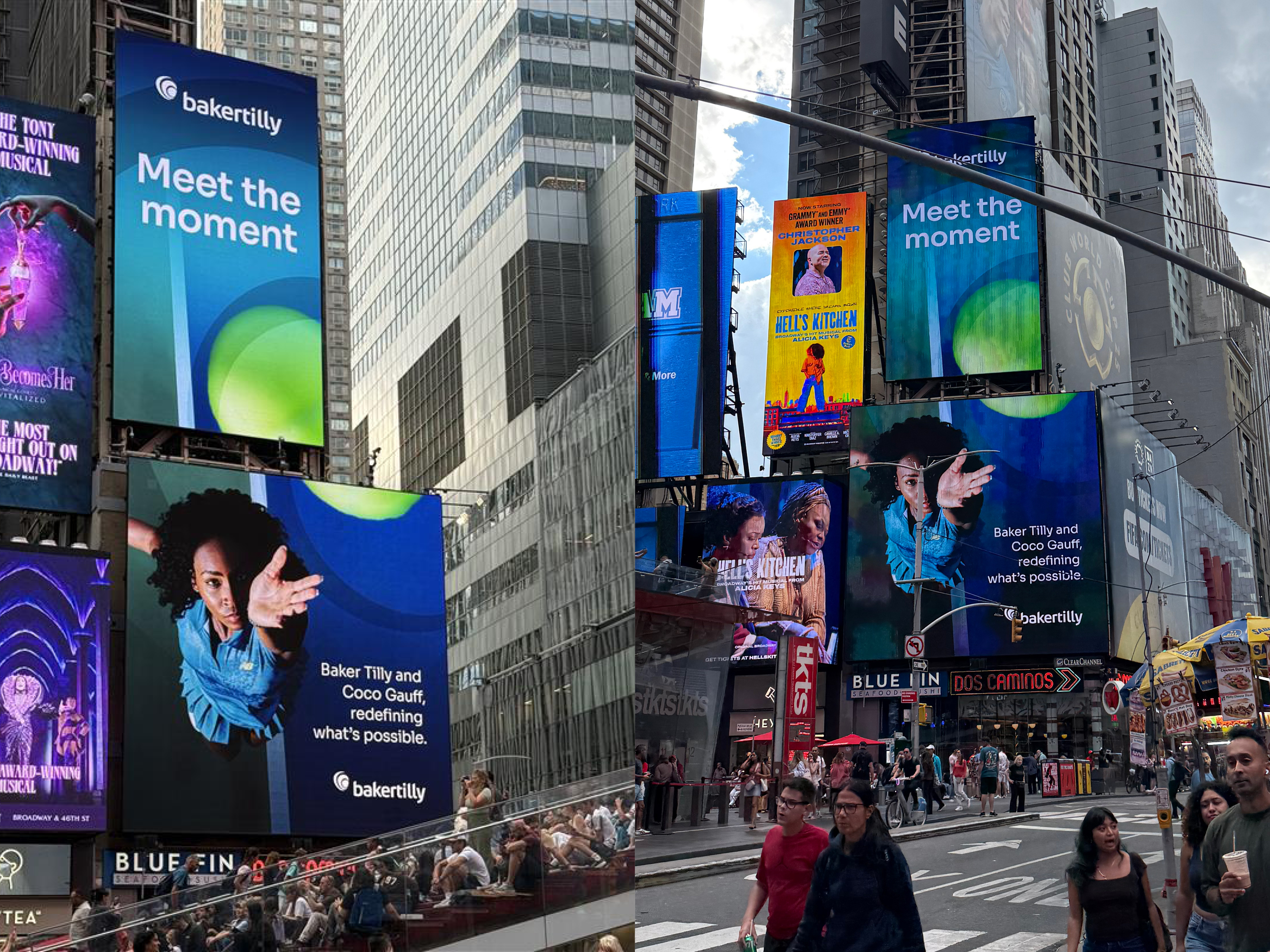
Meet the Moment extended Baker Tilly’s brand across Times Square during the 2025 US Open.
Role
Creative directionConcept development
Scope
Out-of-homeSocial partnershipEvent creative
Timeline
Aug–Sept 2025
Outcome
98M+ out-of-home impressions1M+ social viewsSeven leadsTwo won opportunities
The challenge
Coco’s return carried significant cultural attention. The campaign needed to honor that moment without allowing her visibility to eclipse Baker Tilly’s identity. Across airport corridors, billboards, Times Square, social content, and VIP hospitality, the creative had to stand out, remain cohesive, and connect Coco’s resilience with Baker Tilly’s explorer archetype.
My approach
We centered the campaign on a shared sense of determination: pursuing growth, moving through challenge, and meeting an important moment with confidence. This became the strategic bridge between Coco and Baker Tilly and the foundation for the campaign’s visual direction and messaging.
I designed concepts that conveyed strength, resilience, and focus, then shaped the system to adapt across environments. Location-specific messages made citywide placements feel intentional, while a coordinated visual language connected LaGuardia Airport, print and digital billboards, vertically stacked Times Square units, social content, and hospitality experiences. The result was bold at scale without losing its strategic center.
The campaign’s message system connected Coco Gauff’s determination with Baker Tilly’s growth-oriented brand.
“Monique is an extremely talented and innovative designer. She has a positive, forward-thinking mindset and appropriately recommends design ideas that improve the quality and execution of the Baker Tilly brand.”
The campaign generated 7,833,649 print and 90,712,387 digital out-of-home impressions. Coco’s social partnership added more than 1 million views and 40,000 engagements. The work also contributed to seven leads, two won opportunities, and $500,000 in opportunity value.
By connecting a culturally relevant partnership to a clear brand idea and carrying it consistently across channels, the campaign supported both audience growth and tangible business development.
Print and digital placements generated more than 98 million out-of-home impressions across New York City.
Leadership in practice
Hands-on strategic leadership
I defined the central creative connection and translated it into concepts, messaging, and a flexible multi-channel system.
Brand stewardship and evolution
I connected Coco’s strength and ambition to Baker Tilly’s explorer archetype, extending the brand through a culturally visible partnership without losing its identity.
Connecting creativity to organizational results
The campaign paired large-scale reach and engagement with qualified leads, won opportunities, and documented opportunity value.
From strategy to execution
From public visibility to direct engagement
The LaGuardia experience, social partnership, and US Open hospitality carried the campaign from citywide visibility into direct audience and client engagement.
If you’re building or strengthening a brand, process, or team—I’d love to connect.
Building a scalable system for consistent, locally responsive office experiences
Baker Tilly needed its offices to feel recognizably connected to the brand while still responding to the character and practical needs of each space. I helped translate the visual identity into environmental experiences—shaping how brand elements appeared throughout offices and building a clearer process for carrying the work from floor plan to installation.
One brand language adapted across offices through environmental graphics, dimensional installations, and locally responsive applications.
Applying a national brand across physical environments required both consistency and judgment. Each office presented a different floor plan and mix of shared spaces. The work also crossed real estate, interior design, brand, production, and installation. We needed a system that could protect the Baker Tilly identity without making every location feel identical.
The activation framework defined shared placement priorities while leaving room for local judgment.
My approach
I reviewed office floor plans with project partners to identify where environmental graphics could add value. The activation principles prioritized key moments—reception areas, meeting rooms, cafés, wellness spaces, and shared work areas—without over-branding the environment. I created mockups that helped the team evaluate scale, placement, and the relationship between graphics and architecture before production.
Once concepts were approved, I prepared installation files and coordinated with vendors on proofs and color accuracy. I also consolidated several resources into one guide that brought the workflow, activation principles, creative options, and installed examples together for new and existing spaces.
“She is adept at defining processes, implementing workflows and managing change - all of which are ongoing and imperative as we build the brand & creative function in a scalable and growth focused manner.”
— Rachel Petrie, former Creative Director at Baker Tilly
The outcome
The resulting system streamlined how office branding was planned and implemented across locations. It established consistent principles while preserving room to select ideas suited to each environment—from dimensional growth symbols and privacy film to murals, cityscapes, and greenery. The documented installations show how one brand language can create varied experiences without losing cohesion, helping employees and visitors encounter Baker Tilly as part of the space itself.
Local references and varied applications helped each office feel specific without losing brand cohesion.
Leadership in practice
Brand stewardship and evolution
I translated core visual elements into physical experiences while protecting consistency across different architectural contexts.
Systems thinking
I turned separate resources and decisions into a repeatable workflow and one usable set of guidelines.
Cross-functional leadership
I connected real estate, interior design, agency, brand, and vendor perspectives from planning through installation.
From strategy to execution
The office-branding guidelines capture the system behind the finished environments. They define the activation process, explain where and how brand elements should appear, and pair practical guidance with completed examples.
A flexible environmental toolkit
More than a collection of design options, the guide helps future teams create spaces that feel cohesive, welcoming, and distinctly Baker Tilly.
Building a hospitality brand from the ground up—and an audience before opening day
Copper Cock Tavern began with a 150-year-old building stripped to four brick walls, a copper rooster statue, a rough logo, and a vision for an elevated dining experience in downtown Fond du Lac. I partnered with owner Vince and interior designer Carol to shape the brand and physical space together, then carried that direction into the identity and launch campaign.
The completed venue carries the brand’s high-end, timeless, and warm direction into the guest experience.
Role
Brand strategyIdentity designLaunch marketing lead
A cohesive hospitality brand1,000+ Facebook followers by the soft opening
The challenge
The brand and venue had to take shape at the same time. Decisions ranging from the logo and color palette to interior finishes and opening communications needed to express the same balance of historic character, modern refinement, and warmth. The work also had to build anticipation during construction, before guests could experience the space. Success depended on translating one shared vision across disciplines and giving the community a reason to follow the journey.
My approach
I refined the owner’s initial logo concept, correcting its alignment and typography while exploring a badge that could adapt to uniforms, glassware, merchandise, and marketing materials. The badge became the foundation for an identity built around three brand pillars: high-end, timeless, and warm. I developed the mood board, color palette, typography, and core applications while working with Vince and Carol so the visual brand and interior reinforced one another.
I then translated the identity into a launch system: a single-page website, Facebook presence, monthly email newsletter, and weekly posts featuring construction, team introductions, local history, and menu previews. For the soft opening, I proposed a follower lottery, helped track entries, and paired formal invitations with personal messages to make the experience feel exclusive and welcoming.
The outcome
The completed brand extended consistently across the venue, website, print materials, merchandise, and guest experience. Professional opening photography reflected the same direction established more than a year earlier, showing that early alignment held through construction and execution. The launch campaign grew the Facebook community from zero to more than 1,000 followers by the soft opening, giving the restaurant an engaged prospective audience before its doors opened.
Leadership in practice
Hands-on strategic leadership
I defined the direction and designed the identity, website, collateral, and launch communications.
Brand stewardship and evolution
I turned an early concept into a coherent system across physical, digital, and guest-facing touchpoints.
Connecting creativity to organizational results
I used the construction story to build community interest before opening day.
From strategy to execution
Brand identity
A refined badge and supporting visual system established a flexible identity for digital, physical, and guest-facing applications.
Launch campaign
The identity carried from a pre-opening digital presence into invitations, guest-facing materials, construction storytelling, and the finished venue.
If you’re building or strengthening a brand, process, or team—I’d love to connect.
Turning a high-value market report into a scalable, award-winning content system
REcap is Baker Tilly’s signature quarterly commercial real estate market report and one of the firm’s most downloaded gated resources. I led the creative direction and design of a new visual system that gave the publication a distinctive identity, introduced meaningful quarterly variation, and brought its campaign assets into one cohesive experience.
Four quarterly covers create variation across market sectors while preserving a recognizable publication system.
Role
Creative directionVisual system designTemplate development
Baker Tilly real estate marketingContent teamInternal design team
Outcome
A scalable creative system2025 Content Marketing Award for REcap
The challenge
REcap already had a strong audience, but its visual expression did not reflect that distinction. The redesign needed to stand apart from other firm collateral while remaining part of the Baker Tilly brand. It also had to solve a practical tension: every quarterly issue needed to feel fresh, yet the series had to remain recognizable and efficient for an internal team to produce.
My approach
I built the direction around the report’s structure. REcap covers four commercial real estate segments—multifamily, office, retail, and industrial—and publishes four issues each year. Pairing one segment with each quarter created a clear organizing idea: vary the featured imagery while keeping the composition, typography, color, and circular graphic language consistent.
I designed the report covers first, using them to establish the visual rules for the campaign. I then extended the system across social graphics, digital ads, landing-page imagery, and an email signature block. I also created report and campaign templates the internal design team could use for future issues without losing coherence or craft.
The outcome
The redesign gave REcap a recognizable identity from promotion and download to the report itself. It also turned a one-time refresh into a repeatable system for multiple years of quarterly publishing. In 2025, the Content Marketing Institute honored Baker Tilly with a Content Marketing Award for “Best Use of White Paper (One or a Series),” recognizing the report and the coordinated work behind it.
Turning an embedded emphasis into a distinct, industry-aligned academic program
At Lakeland University, graphic design was an emphasis within the Art major, limiting its visibility and its ability to reflect contemporary practice. As Assistant Professor of Graphic Design, I led the work to establish it as a standalone academic program—shaping the strategy, developing the curriculum, and guiding the proposal through institutional review.
Working with students in Lakeland University’s graphic design classroom.
Role
Program leadCurriculum designer
Scope
Program strategyCurriculum redesignEvidence gatheringApproval
Partners
FacultyAcademic leadersAdministrative leaders
Timeline
2016–2017Enrollment tracked through 2021
Outcome
Standalone major and minor launched in fall 2017Enrollment nearly tripled by April 2021
The challenge
The work began as a curriculum revision, but the deeper need was structural. Creating an independent program required us to demonstrate student demand, distinguish Graphic Design from Studio Art, modernize the curriculum, and build confidence that it could support enrollment goals. The proposal also needed alignment across school faculty, an academic programming committee, executive leadership, the full faculty, and the university’s accreditation liaison.
My approach
I reframed the work around two needs: what students required from a relevant graphic design education and what evidence the university required to support it.
Working with faculty and administrative partners, I developed the proposal and curriculum materials. In response to reviewers’ questions, I incorporated admissions-funnel data, market demand, prospective-student interest, competitive context, and facilities considerations. I also helped define Graphic Design and the newly named Studio Art program as distinct but complementary disciplines.
The redesigned curriculum added interactive design, motion graphics, brand identity, web and app design, and community-based work—connecting students’ academic experience more closely to contemporary practice.
The outcome
The concept received institutional approval in February 2017 and formal faculty approval in April. The accreditation liaison determined that no additional formal review was required, allowing Lakeland to launch the standalone Graphic Design major and minor in Fall 2017.
Active enrollment in the standalone program grew from 12 majors and minors in January 2018 to 33 by April 2021—a 175% increase. By the 2021 program review, many design courses were filling, and the university had committed to moving the program into a classroom three times larger. Students gained a more visible, focused pathway into the design profession, while Lakeland gained a program positioned for continued growth.
Graphic Design program webpage
The public program page makes the outcome tangible. It presents a commercially focused curriculum, cooperative education, and real-world design projects—carrying forward the industry alignment and experiential learning at the program’s foundation.
As an Assistant Professor of Graphic Design at Lakeland University, I initiated and led partnerships with Lakeshore Technical College, Milwaukee Area Technical College, and Northeast Wisconsin Technical College. The goal was to help graphic design graduates transfer efficiently into Lakeland’s bachelor’s program without repeating comparable coursework or weakening the value of the degree.
A student-facing recruitment piece promoting the NWTC-to-Lakeland completion pathway—one of three partnerships developed through the initiative.
Role
Initiative leadCurriculum strategist
Scope
Three technical college partnerships
Outcome
Three articulation agreements executed
The challenge
Each college had a different curriculum, credit structure, and set of priorities. We needed to determine which learning experiences were equivalent, what students still needed to complete, and how those requirements could fit into realistic timelines.
The work also involved tuition, scheduling, staffing, facilities, recruitment, and institutional approval. Progress depended on aligning faculty, registrars, admissions teams, operational leaders, and executives across three institutions.
My approach
I compared curricula, identified potential course equivalencies, and created term-by-term completion scenarios for different course loads and timelines.
I kept the student experience at the center while protecting Lakeland’s academic standards. During the MATC discussions, for example, I challenged an overreliance on self-designed coursework and advocated for a pathway that respected prior learning while preserving meaningful advanced study.
My role moved between strategy and execution: initiating outreach, analyzing curricula, writing proposals, developing schedules, presenting recommendations, supporting student recruitment, and guiding the work through review and approval.
I continued stewarding the partnerships after approval, revisiting transfer pathways as partner curricula evolved so the agreements remained accurate and useful.
Selected proposal pages show the partnership rationale, transfer-credit mapping, and four-semester completion plans.
The initiative resulted in three executed articulation agreements, each supported by institution-specific transfer recommendations, clear completion pathways, partnership frameworks, and recruitment and implementation planning.
Together, the agreements created more direct routes to a bachelor’s degree, supported Lakeland’s enrollment and regional partnership goals, and established a repeatable model for future collaborations. Across all three, the leadership approach remained consistent: understand the people involved, map the system, protect what matters, and create enough clarity for groups to move forward.
“Monique has led the way in developing a bachelor’s completion program in graphic design for some of our technical college partners. Monique represents Lakeland and her program with the utmost professionalism.”
— Joshua P. Kutney, Executive Vice President / Vice President for Academic Affairs
Leadership in practice
Cross-functional leadership
Aligned stakeholders across disciplines, leadership levels, and institutions.
Systems thinking
Turned complex curriculum and operational information into clear, repeatable decision tools.
Hands-on strategy
Shaped the partnership approach while directly contributing to research, proposals, completion plans, recruitment, and implementation.
If you’re building or strengthening a brand, process, or team—I’d love to connect.
Building a repeatable bridge from classroom learning to community-centered creative practice
At Lakeland University, I created GDN 401 Graphic Design Practicum as a capstone graphic design course that pairs freelance business fundamentals with service learning. Across four spring offerings, students managed real client work for community non-profit partners while learning the business of design. The Spring 2022 partnership with Lemons of Love shows that model in action through three multichannel event campaigns.
Student-created campaign materials in use at a Lemons of Love fundraising event.
Capstone curriculumCommunity partnershipsCreative directionCritiqueProfessional-practice systems
Timeline
Spring 2019–Spring 2022
Outcome
A repeatable client-based learning modelComplete marketing campaign assets to promote three non-profit events in 2022
The challenge
Students needed more than a portfolio assignment. They needed a supported way to navigate client conversations, ambiguous feedback, changing content, production details, and the business decisions surrounding creative work. The course also had to serve community partners responsibly, balancing student exploration with usable deliverables and professional standards. In 2022, that meant coordinating teams and one non-profit across three events, distinct audiences, and shared print and digital needs.
My approach
I structured the course around an end-to-end freelance workflow. Lessons on pricing, contracts, copyright, bookkeeping, taxes, time tracking, and invoicing led into client research, a creative brief, concept development, presentation, critique, revision, production, and delivery.
For Lemons of Love, students met with non-profit representatives and developed concepts for a charity barbecue, golf outing, and 5K. After the client selected one concept for each event, I translated feedback into actionable direction and guided peer critique and individual coaching. Students extended the campaign systems across sponsorship flyers, social graphics, Facebook covers, posters, postcards, billboards, and event banners. They also tracked time, prepared practice invoices, documented their process, and presented at Research Day.
Three event campaigns, one professional-practice framework
The three campaign families show selected concepts adapted across print and digital formats. Each retains a distinct direction while remaining cohesive across touchpoints.
Pink Lemonade 5KLemons on the LinksIMSA Race Weekend Charity BBQ
The outcome
GDN 401 became a repeatable capstone connecting creative craft, professional judgment, and community contribution. Lakeland’s dean called the inaugural course particularly impressive, citing real-world community design problems, partner participation, and student presentations.
In 2022, Lemons of Love received complete, ready-to-use marketing campaign assets for three non-profit events, including coordinated print and digital materials for each campaign. Students gained real-world client experience and strong portfolio pieces just before graduating and entering the job market.
Leadership in practice
Systems thinking
I turned freelance practice into a repeatable framework connecting business fundamentals, creative development, feedback, and delivery.
Team leadership and talent development
Peer critique, individual coaching, client presentations, and reflection helped students strengthen their work and professional confidence.
Cross-functional leadership
I aligned student teams, non-profit representatives, and academic goals around work that supported learning and remained useful to the partner.
If you’re building or strengthening a brand, process, or team—I’d love to connect.
Creative leadership is strongest when strategy, systems, and people move together.
Throughout my career, I’ve helped organizations bring those elements into alignment—clarifying the idea behind the work, translating it into meaningful creative direction, and building the conditions that help teams carry it forward.
My work began in graphic design, and creative judgment remains central to how I lead. Over time, the scope expanded from developing identities and campaigns to building programs, guiding teams, shaping brand systems, and creating the structure that allows strong work to scale.
I’m drawn to the moment when an idea begins to become real—when strategy turns into something people can see and use, when complexity becomes navigable, and when collaboration produces work that genuinely reflects an organization’s purpose.
“I’ve come to appreciate Monique’s confident and steady leadership, especially in navigating changes in scope and balancing differing viewpoints. She’s been great at keeping the group on track while ensuring everyone feels heard.”
— Georgina Giannelli, former Senior Director, Pursuit Strategy & Marketing at Baker Tilly
What guides my work
These principles consistently shape how I lead.
Clarity creates momentum.
Strong work begins with shared understanding—of the goal, the audience, the decision, and what matters most.
People shape the outcome.
Thoughtful mentorship, useful feedback, and meaningful ownership help individuals and teams grow stronger together.
Systems make creativity scalable.
Clear processes, shared standards, and practical tools give teams more freedom to focus on ideas, judgment, and craft.
Strategy connects vision to action.
The most effective creative leadership connects vision to experiences people can see, understand, and act on.
My path
My career has taken me across enterprise organizations, higher education, and founder-led initiatives. Each environment has strengthened a different part of how I lead today.
Early in my career, I worked as a graphic designer developing brand identities and marketing initiatives. That work taught me to connect strategy with visual expression and to see every touchpoint as part of a larger experience.
Later, as an Assistant Professor—and then tenured Associate Professor—of Graphic Design, I led curriculum and program development, mentored emerging designers, and built community partnerships that brought real client work into the classroom. That experience deepened my understanding of leadership as the work of creating clarity, building capability, and giving others room to grow.
At Baker Tilly, I have helped lead design and contributed to brand and creative strategy within a large national organization, working in close partnership with creative leadership. My work has spanned creative direction, team development, brand stewardship, and the systems that help high-volume work remain cohesive.
Across each of these roles, the focus has remained consistent: strengthen the idea, support the people behind it, and build a clear path from vision to execution.
The work that excites me most sits at the intersection of brand strategy, creative direction, people leadership, and systems building. I’m especially drawn to roles where I can help an organization clarify what it wants to express, raise the quality of the work, strengthen the team, and improve how ideas move into the world.
I’m especially interested in organizations that define success more broadly than financial performance and contribute something meaningful beyond themselves. That impact can take many forms; what matters to me is helping shape work that creates value for people, communities, or the wider world.
AI-aided design has fundamentally shifted how I approach creative work. I’m excited to build AI-driven creative frameworks that expand exploration, make strategic and creative direction more reusable, and help teams work with greater range and clarity. I want to remain at the leading edge of how AI is shaping creative practice—not as a substitute for human talent, but as a way to support and amplify it—while keeping human judgment, brand integrity, and craft at the center.
Outside of work
I live in the San Juan Mountains of Southwestern Colorado with my husband, three dogs, and two cats. Much of our free time is spent outside—hiking local trails, floating the river, skiing, or heading out for ATV rides in the mountains.
We recently bought a home in the mountains that has become our ongoing project. We’ve been steadily improving the property inside and out—starting with exterior work that needed immediate attention, including fencing and fire mitigation. We’re also planning larger interior renovations, including updates to the kitchen and bathroom and longer-term structural improvements.
Across both my work and my life, I’m guided by a simple goal: to leave things better than I found them.